Page Under Construction
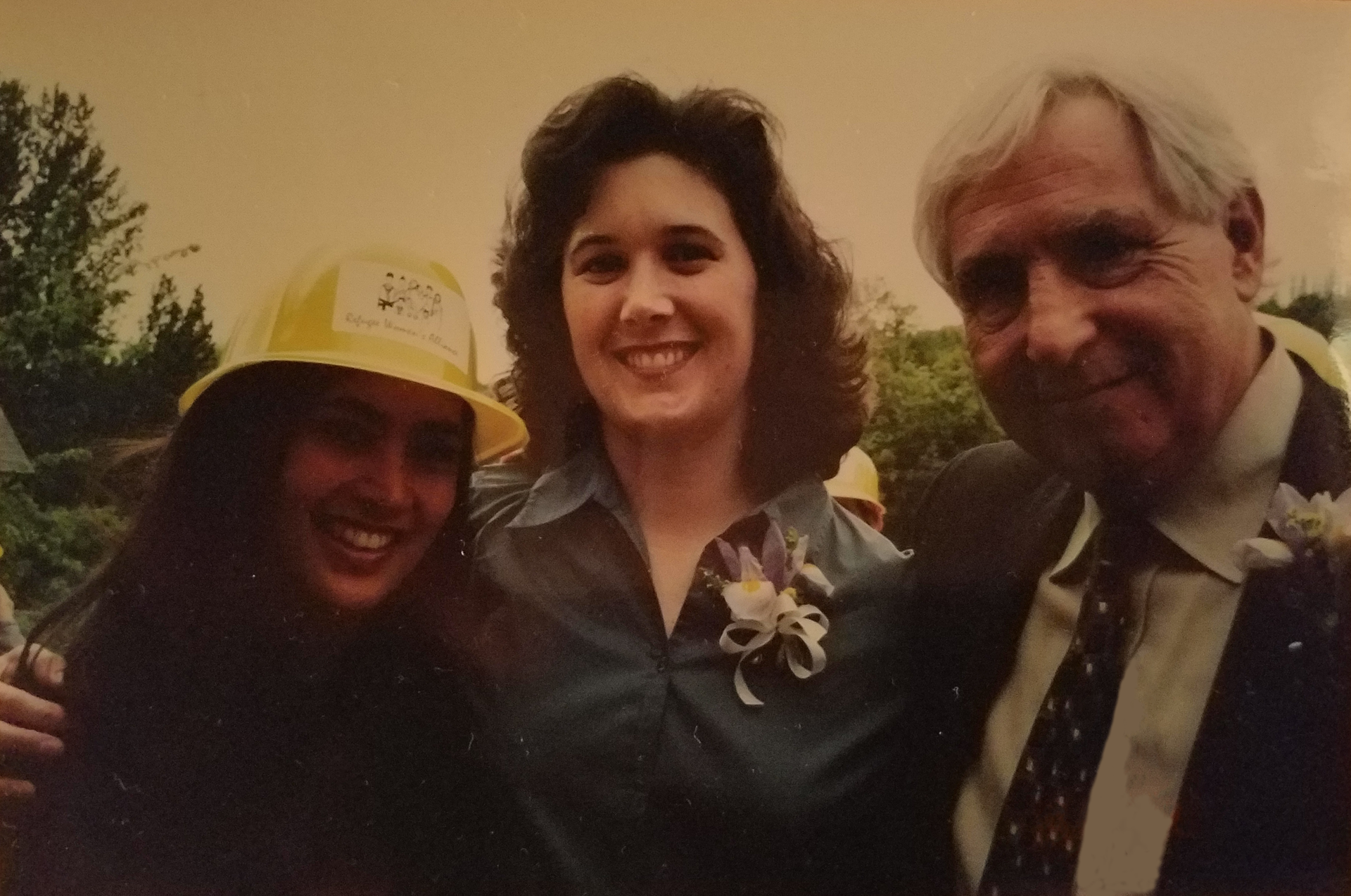
Refugee Women's Alliance Construction Project Groundbreaking 2001
Ramlah with former ReWA Executive Director Sue Wilkes and former Seattle Mayor Paul Schell
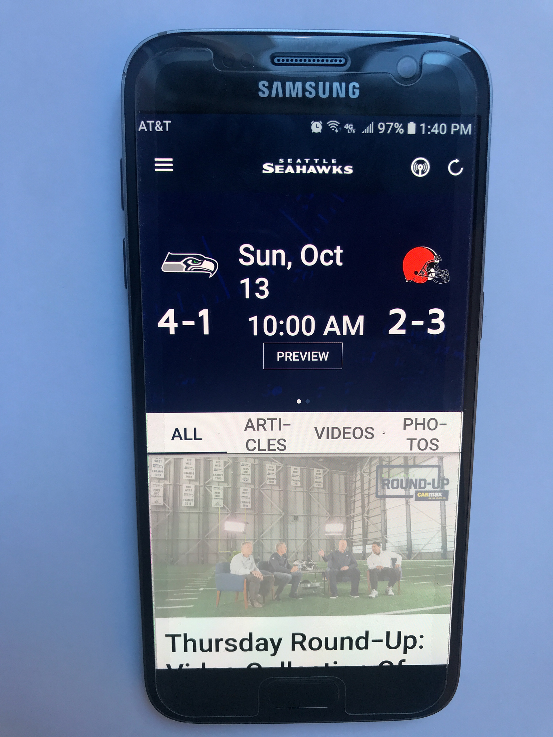
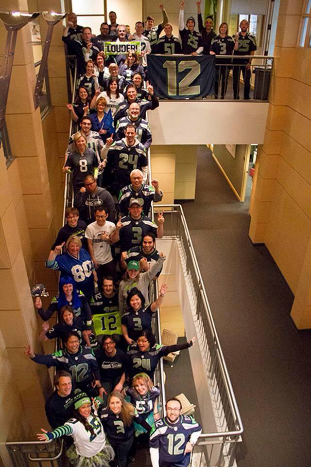
Since Super Bowl XLVIII in 2013, when the Seattle Seahawks became NFL champions, American football fans around the world have followed the team closely. It is not only avid fans who download the Seahawks App to their phones. The avid fan, though, wants specific information that is hard to find in the current app experience. They have unsolved problems and unmet goals.
I was part of a team of three UX Design students who had two weeks to identify problems with the app, then re-imagine how a frequent user could consume content daily on the platform. My role was Interaction Designer.
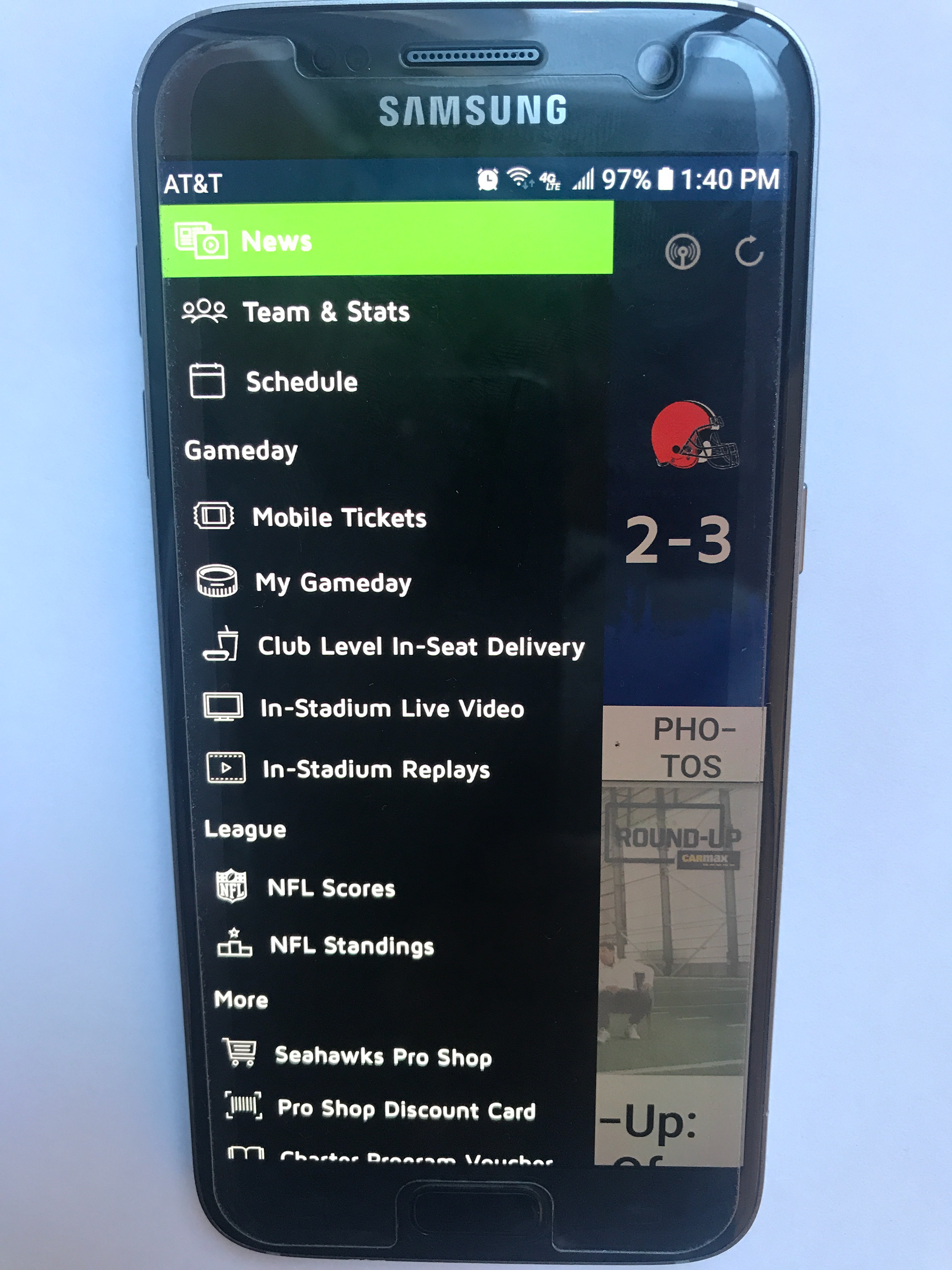
Through our user research, we learned that avid fans downloaded the app with the hope of having all things Seahawks available at their fingertips at a moment’s notice. We focused on the Android mobile experience and learned that the design of the existing landing screen and the options under the menu were the first source of confusion for users. The navigation bar on the landing screen was in the middle of the page and some of the iconography was confusing. The symbol for the radio streaming button is a case in point.
(Visual Design by Team Member Will Trogdon.)
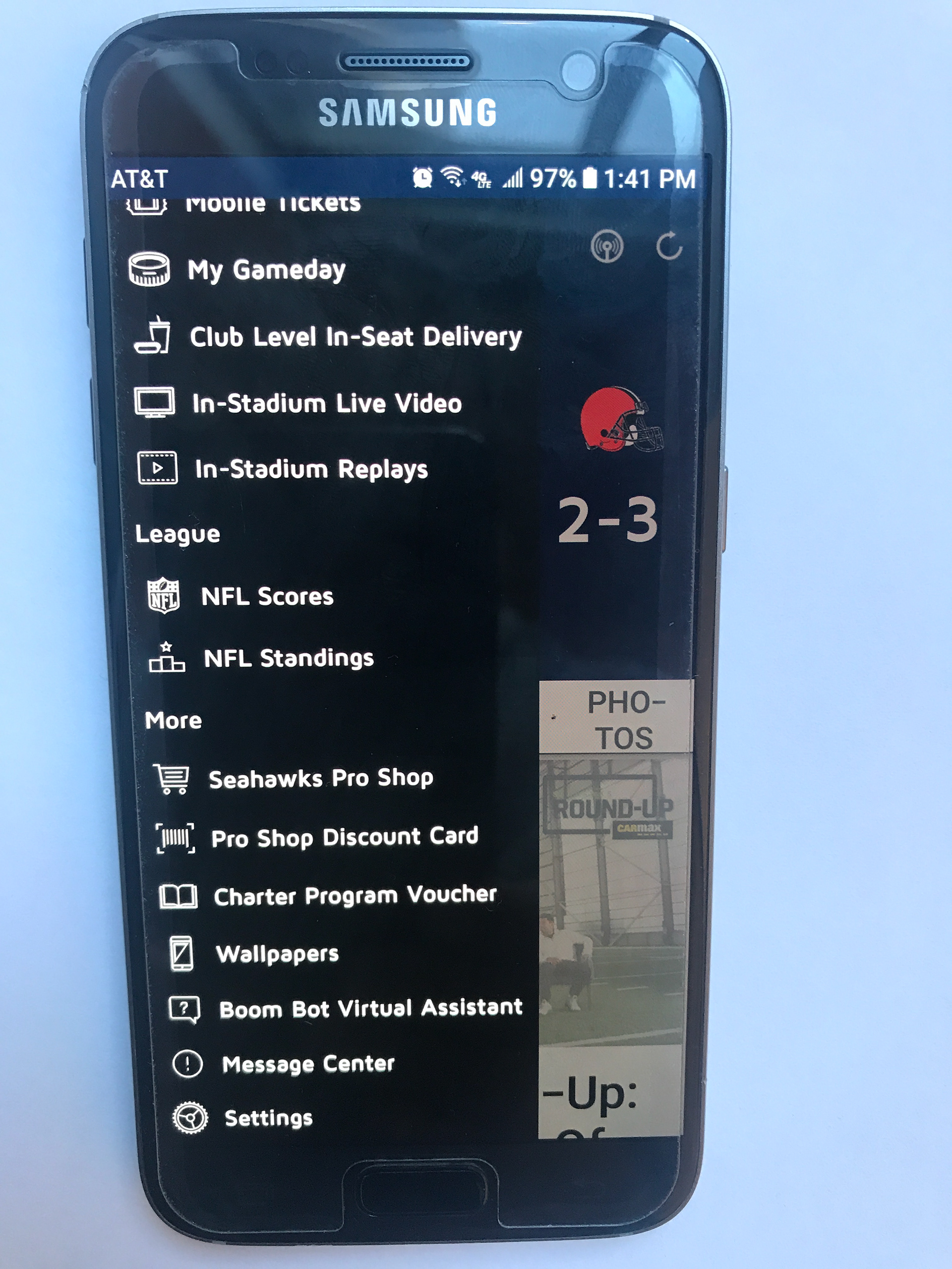
When users examine the offerings on the app menu, under the hamburger icon, they are confronted with many more icons, several of which were also ambiguous and therefore confusing. The sheer number of options on that menu often overwhelmed users, as well.
(Visual Design by Team Member Will Trogdon.)
When considering regular or daily use, it is entirely understandable that different types of users will use their Seahawks App to access different types of information. An avid Seahawks fan who lives in Seattle is likely to want different information than a fantasy football player who lives in Nebraska, particularly on a regular basis. Our team made the hypothesis that app users would appreciate the ability to personalize their app. By exploring this possibility, we could keep all of the current features on the app but allow users to choose which features were most important and have those within easy access.
We performed an affinity mapping exercise as a team to determine user pain points and goals:
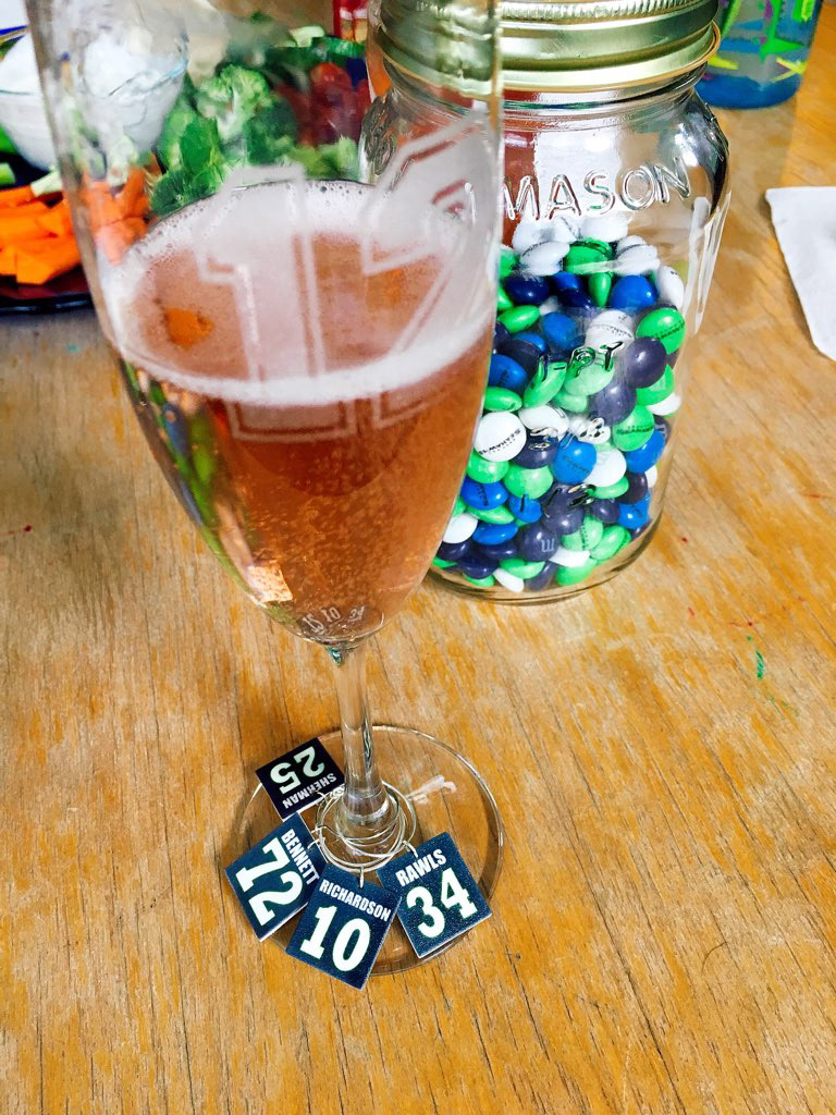
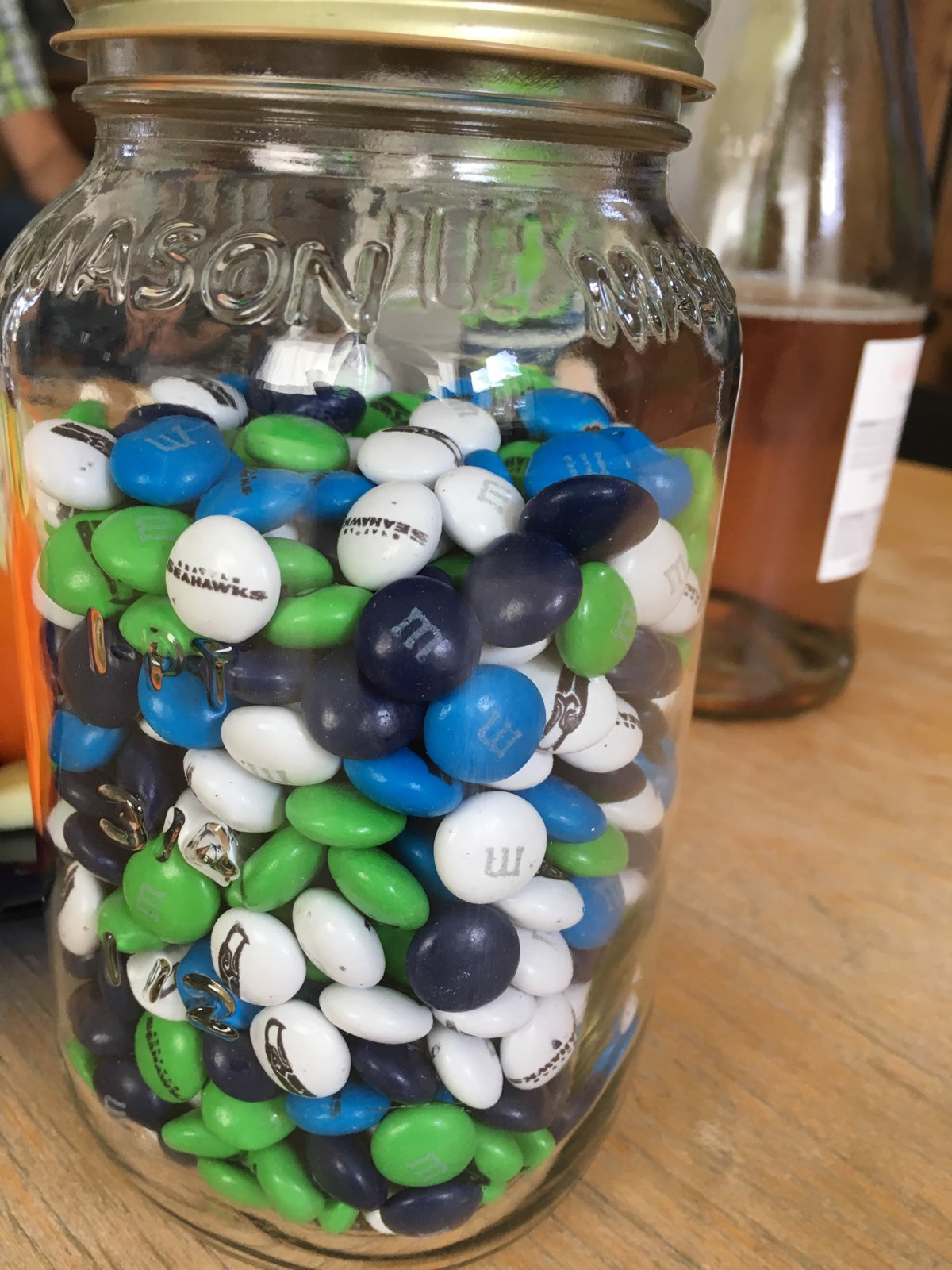
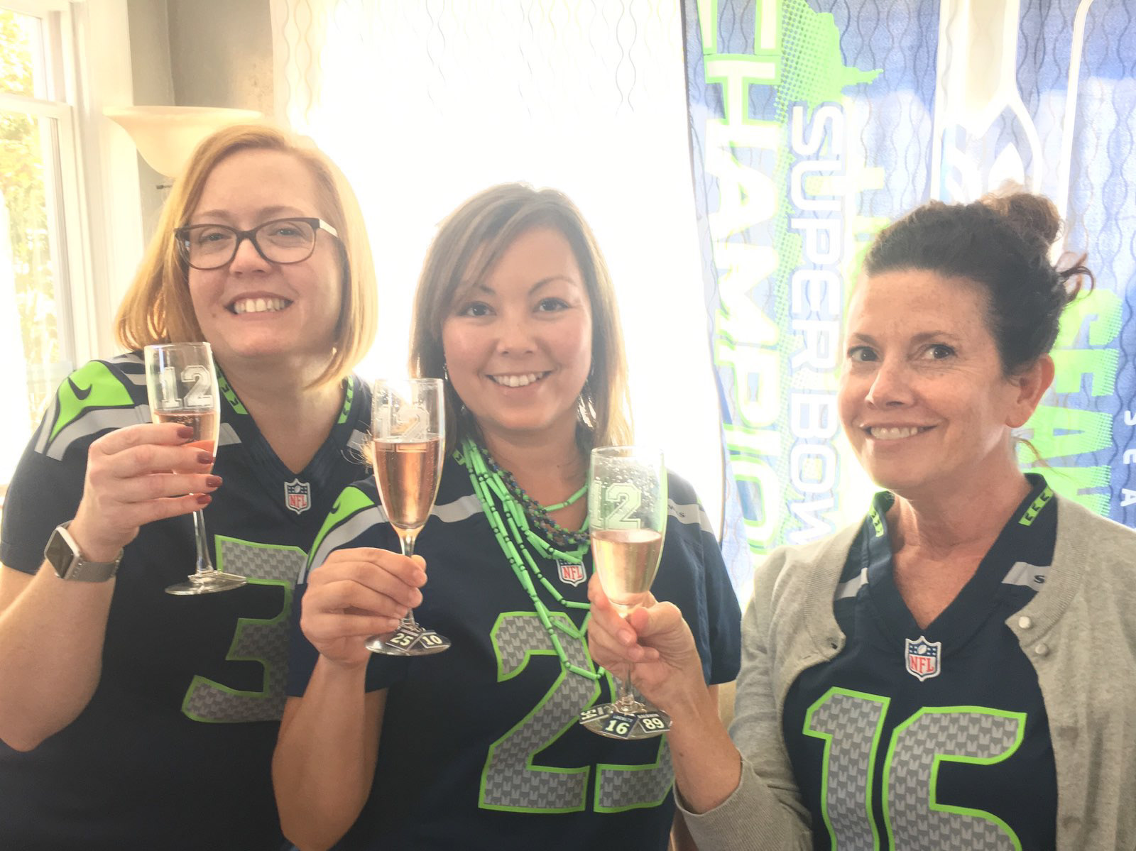
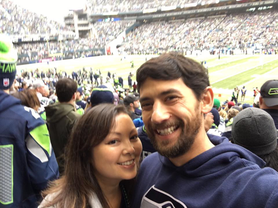
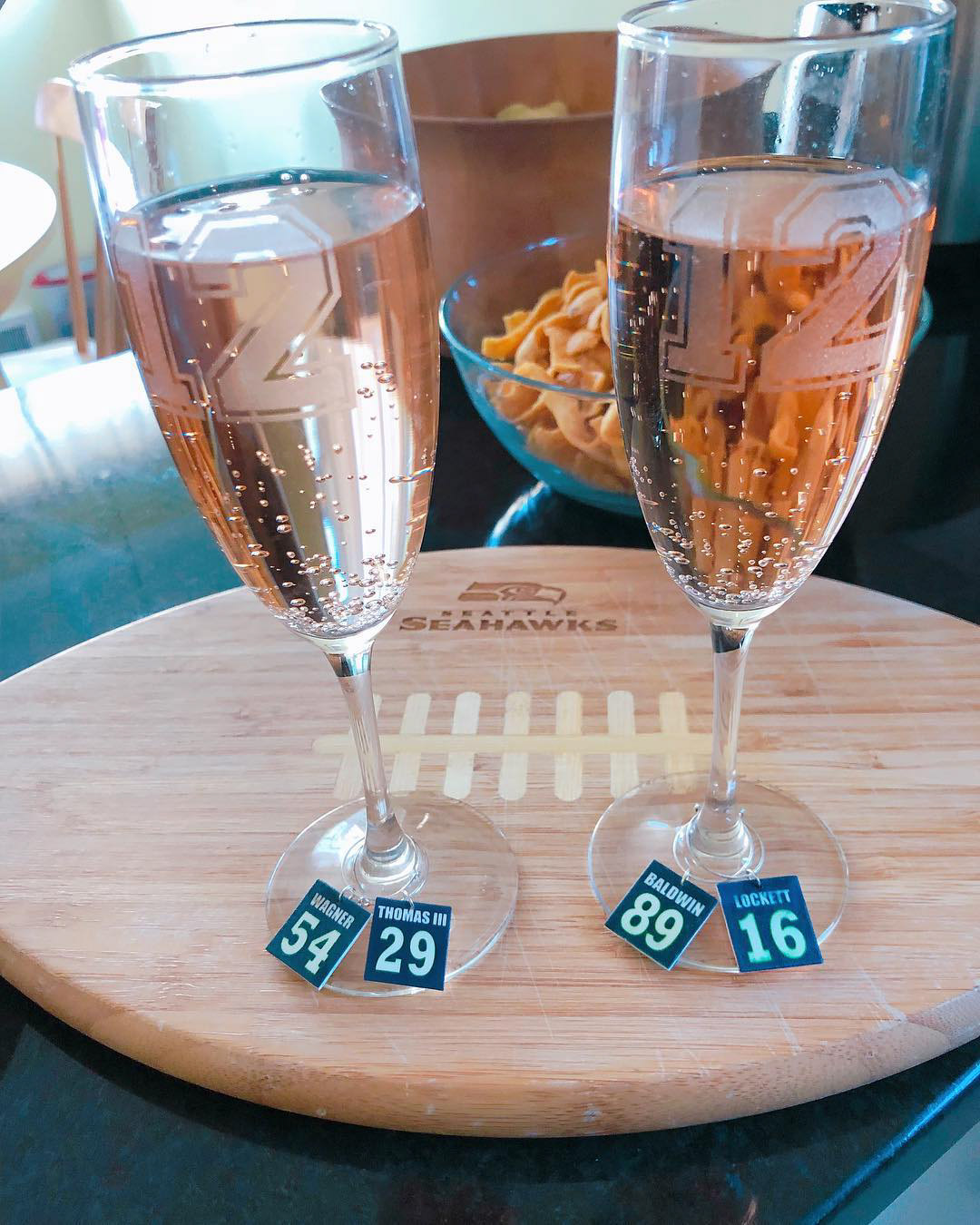
Additionally, during our user research, we consistently heard about one topic from the avid sports fans our UX researcher interviewed. We heard that the social aspect of football was one of the most important things to our users. They love dressing as a member of the Seahawks fan tribe on game days and on the Fridays before weekend games. They consume Seahawks themed merchandise with joy. They value making plans with their friends to watch games together at their homes, in bars, or in stadiums.
They get joy from discussing the Seahawks with their friends between and during games.
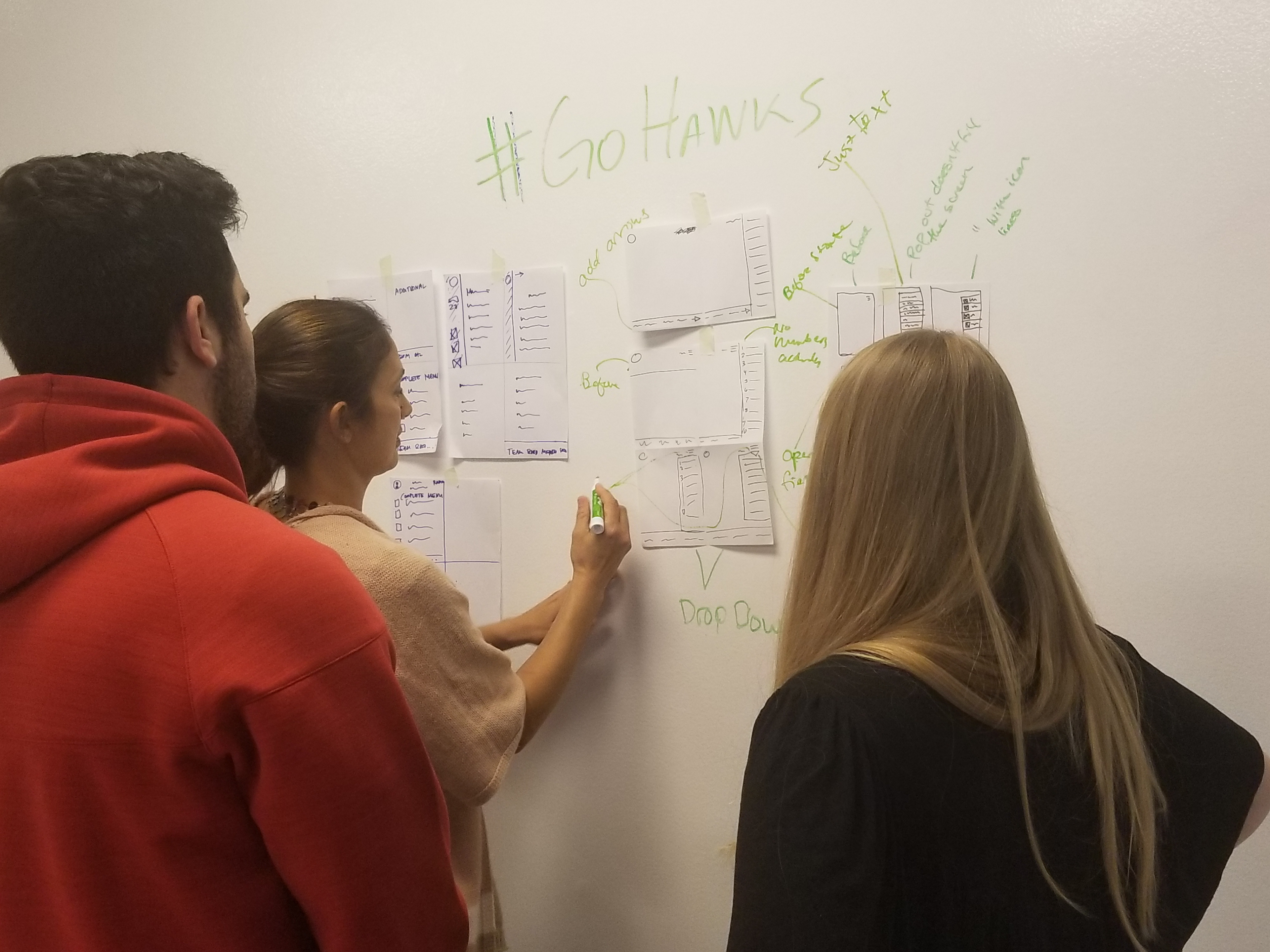
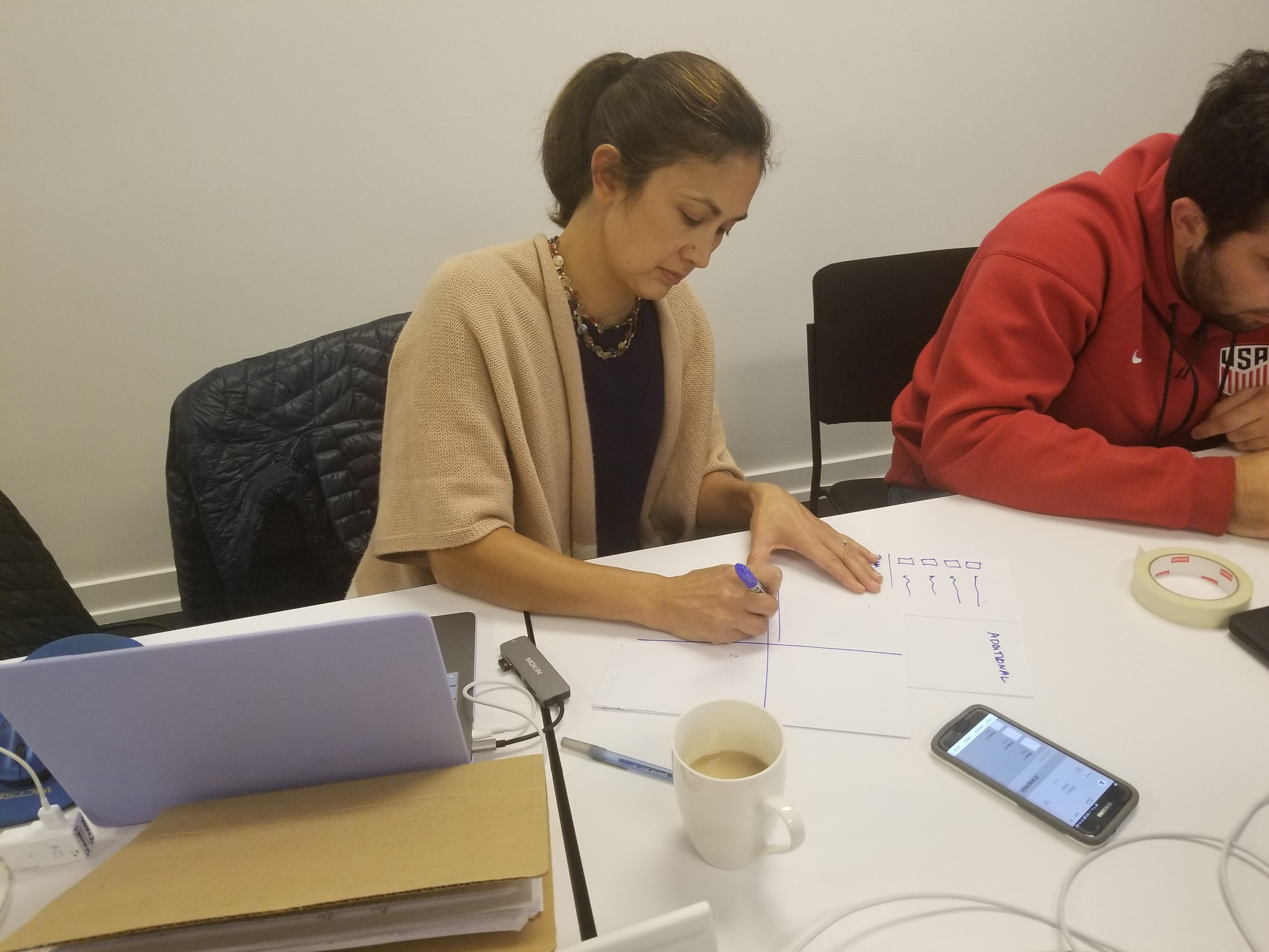
In order to create our first complete prototype, I sketched several different versions of user flows, task flows and wireframes.
The image on the left shows a segment of the first User Flow I sketched, specifically, the segment that asks users whether they want to customize their Seahawks App navigation, and whether they’d like the app to collect Seahawks related posts from their social media accounts and display them through one Seahawks App feed.
Regarding the first part, we wanted to address the problem many users expressed, that the existing app navigation is messy and full of so much information. During our research, we also heard repeatedly that the social aspect of football was the thing our users valued most. They talked about feeling like they’re part of a club on game days by dressing in Seahawks jerseys and making plans with friends to watch the games together.
Our project researcher developed a user persona, Josh, a 38 year old avid Seahawks fan.
(Persona developed by Researcher Shoshanna Thomas-McCue.)
As Josh says, “It’s all about togetherness.”
That key insight led us to prioritize adding some social element to our redesigned app, which resulted in the feed that collects and displays Seahawks related posts from your friends.
I developed the user flow and a specific task flow for Josh:
Our avid Seahawks fan, Josh, accepts every offer we give him to personalize his app.
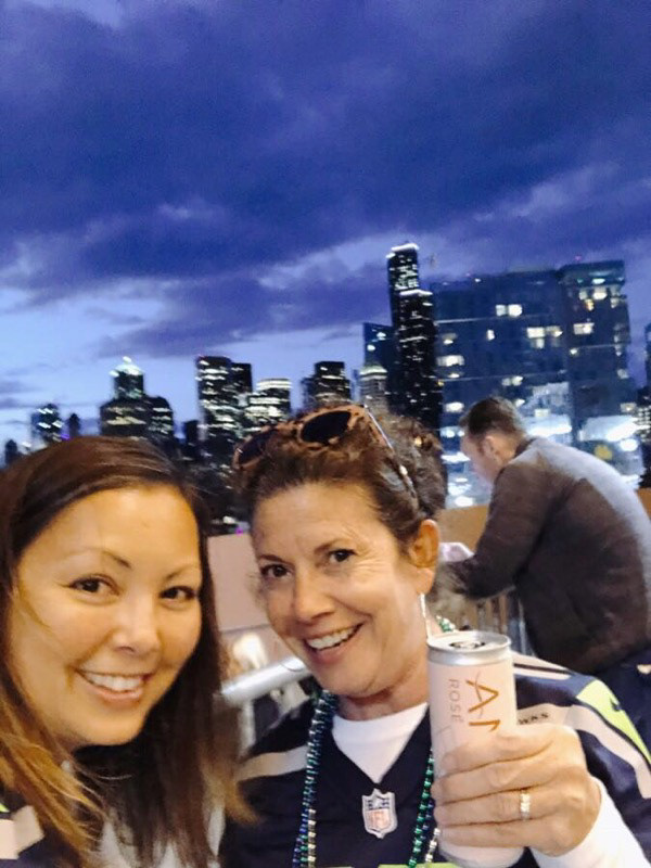
Next, our UX Design team of three went to bars before and during the Seahawks game against the Rams on Thursday, 3 October 2019. That evening, we saw this unique sports fan social experience in action. We conducted usability tests of the first iteration of our prototype with the help of seven users. The testers included a fan with a permanent Seahawks tattoo on his arm, two women who stopped at a bar on the way to the game, various people watching the game in bars, and a woman who was waiting for her friend to arrive so they could watch the game together.
(I took the four photographs above and am therefore not in the photos with users.)
We did take a team photo together that evening:
In all we conducted four rounds of usability testing. After each round, we addressed pain points users helped us identify.
For example:
The first task we gave all usability testers was to show us where they would go on the screen to learn how to create a profile or account. During our first usability test, the first place all users tapped was the upper left corner of the screen. I had placed a hamburger menu that location was incorrect. The second place they tapped was the upper right corner of the screen. I had left the two icons from the existing app there, so again, they were incorrect. It wasn’t until the third tap or even later that our first testers found I had placed a link to create a profile down in the bottom right hand corner. I addressed that problem in the next iteration by creating both an account button in the upper left hand corner and a create account button in the bottom right hand corner.
Later in our task flow, we asked users to show us how they would like to customize their notifications and alerts, including banners and sounds. In the first iteration of our clickable prototype, the mobile image in the middle of the slide above, we did not clearly offer users the ability to select no alerts. We made the assumption that if a user selected nothing on this page, they would not receive any alerts. Assumptions can get us in trouble, though, and this omission confused some users as they went through that first iteration. In the image on the right, we added an option to clearly select no alerts.
This customize-notifications screen that has given our team the most trouble. By the end of the two week project time frame, we believed we still did not have the right design for this page.
We asked usability testers to simulate connecting their Seahawks App to their social media accounts. In the first iteration, the middle screen, users gave feedback that we did not provide enough explanation about what they would get if they connected their accounts to the app. In later iterations, the screen on the right, we added the explanation:
“Select platforms. We’ll display all posts from the social media accounts you follow with hashtags related to #seahawks.”
Working as a team, we used the results of a card sort to determine the best way to personalize the landing screen for each user. We used the design studio method to come to consensus as a group:
The latest iteration of our low fidelity prototype:
[add video]
Latest iteration of high fidelity prototype:
[add video]
Next steps
[add slide from presentation]